5.3.6. Ladder Plot
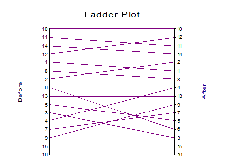
The ladder plot shows the relationship between the ranks of data in two columns. This plot is used (usually) to visualise the effects of a treatment on the same set of subjects before and after a treatment. Select the two columns using [Column 1] and [Column 2] from the Variable Selection Dialogue.
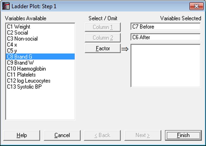
Optionally, one or more factors can be selected, in which case the program will display a list of all possible combinations of factor levels. The unchecked levels will be excluded from the plot and the remaining levels will be distinguished by different colours.
Each bar on the ladder represents a row of data. The ranks of data in each row are plotted on the left and on the right of the ladder for columns 1 and 2 respectively. The same numbers on either side are then connected by a line. Therefore, if a row has the same rank in both columns, its bar will be horizontal.
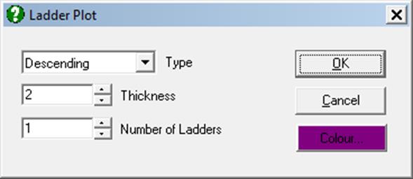
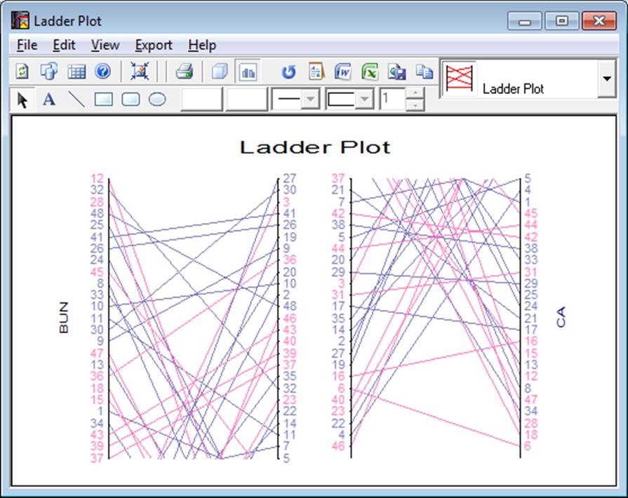
The plot can be split into a number of ladders laid out side by side instead of one single ladder. This is useful for plotting columns with a large number of rows. The ranking can be in Ascending or Descending order. All these options can be controlled from Edit → Ladders dialogue.
The Chart Gallery (i.e. the drop-down list of graphics options displayed on the top-right of the Graphics Editor window) provides quick access to the other two paired data plots, 3D Histogram and Bland-Altman Plot.