4.3.2. Bar Chart
Bar Chart Variable Selection Dialogue is similar to that of X-Y Plots procedure. Each data series can be a column of the data matrix, or alternatively, a subsample of a data column defined by one or more factor columns. Although an unlimited number of data series can be plotted, properties of only the first nine can be individually controlled from the Edit → Data Series dialogue. The rest of the series will repeat the properties of the first nine in a circular fashion.
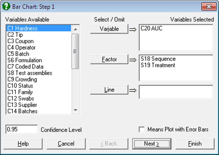
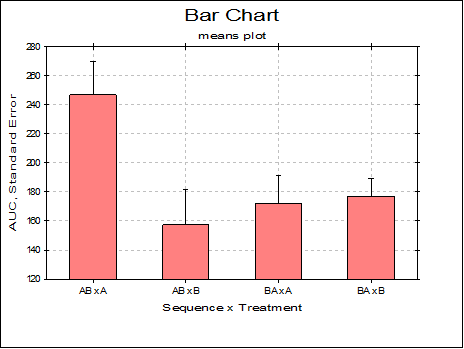
Means Plot with Error Bars: If this box on the Variable Selection Dialogue is checked, each bar on the plot will represent the mean of a data series rather than an individual data point. For a detailed description of this option see 4.1.1.3. Means Plot. X-Y Plots, Polar Plot, Area Chart and Ribbon Chart procedures also support the same capability.
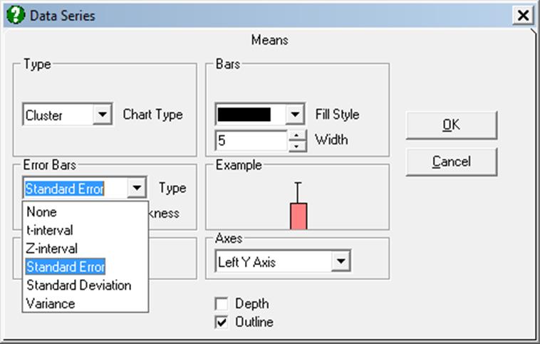
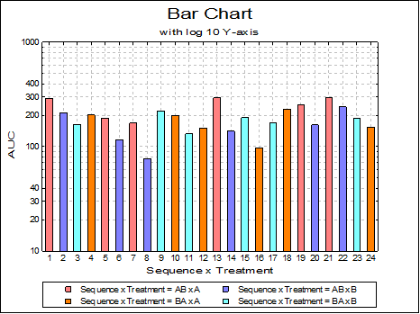
Cluster, overlap, stacked and percentage bar charts can be drawn with or without depth, with symmetric / asymmetric error bars and with two independent Y-axes.
The bars can be left-justified or centred in the plot area by entering and editing the following line in Documents\Unistat10\Unistat10.ini file under the [Options] group:
BarsCentre=1
One difference from X-Y Plots is that there are no interval inputs for the X-axis here since bar charts are always drawn against the index (row numbers). A second difference is that bar charts can only have one right Y-axis. Other specific features are as follows:
Lines: Up to three columns can be selected from the Variables Available list to draw as lines alongside the bars by clicking on [Line]. When at least one column is selected as line then an Edit → Lines option will be available. All line controls provided for X-Y Plots procedure (e.g. Line options None, Straight, Curve, Trend, Symbol, independent Right Y-axis) will be available.
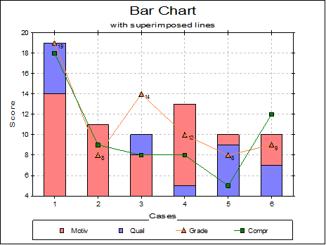
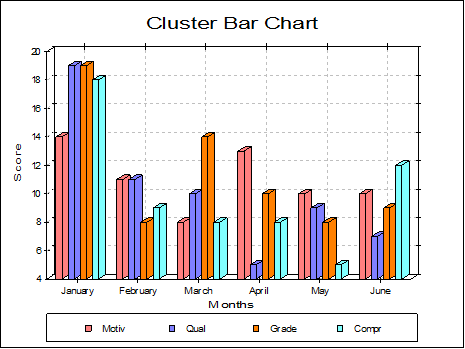
Cluster: Bars having the same row number (but belonging to different series) are drawn next to each other. One such group is called a cluster. There is a small gap between clusters. If there are negative numbers in data then the bars will be drawn upside-down. The missing value positions will be left blank.
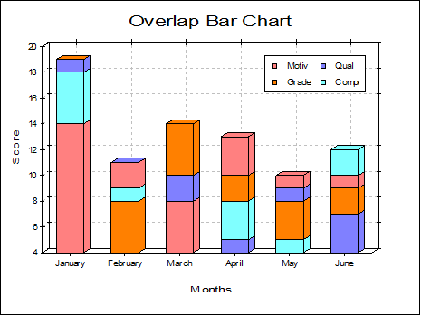
Overlap: Observations having the same row number are sorted and drawn in the same location in descending order. In this way, all observations will have visible parts on the same bar (distinguished either by different colours or patterns). When the column sizes are relatively large the overlap bar charts give better results than the cluster bar charts.
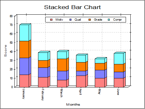
Stacked: This is similar to the overlap bar chart but bars belonging to the same row of the different series will be stacked. Y-axis (or axes) will be rescaled with a maximum value large enough to display all stacked bars.
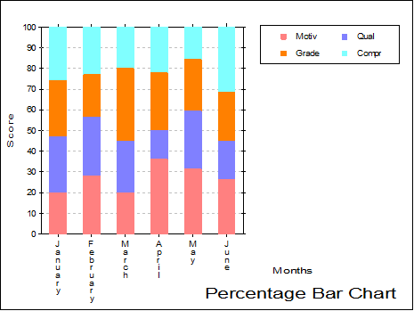
Percentage: Individual observations are scaled such that the sum of values for a row is 100. Bars reflect the relative magnitudes of individual values within the same row.